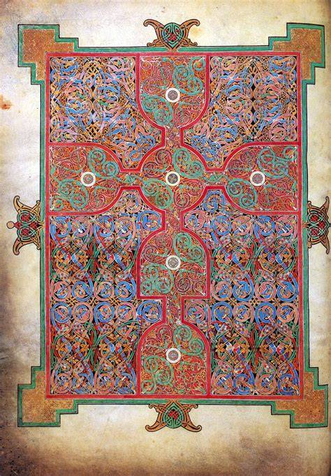
The cross-carpet page from the Lindisfarne Gospels is an ornate non-textual page in the shape of a cross, densely filled with geometric patterns, interlace, birds, and serpentine creatures. The page for St. Matthew, folio 26 verso, was produced in Northumbria between about 698 and 721 and is a prime example of Insular or Hiberno-Saxon art.
Its central cross is decorated with animal interlace characteristic of pagan cultures, while the cross itself carries Christian meaning. The contrast between the chaotic mass of twisting creatures and the ordered structure of the cross creates a visual balance between earthly complexity and divine order.
What is a cross-carpet page?
Carpet pages, sometimes called “cross-carpet pages,” are illuminated manuscript pages with a design generally in the shape of a rectangle, filling the outline of the page itself, with interlace and decorative geometric forms woven within the general rectangular form.
Such pages appear in Christian, Islamic, and Jewish illuminated manuscripts. Usually, there is hardly any text on these pages, or no text at all. The designs of these manuscripts usually are quite symmetrical and typically have a strong vertical axis, and sometimes horizontal axes as well, which often forms the shape of a cross.
They are called “carpet pages” because they are densely decorated and patterned like a Persian carpet, but are also in the shape of a cross. Their position before the Gospel text gives them a distinctive function within the structure of the manuscript.
The St. Matthew cross-carpet page
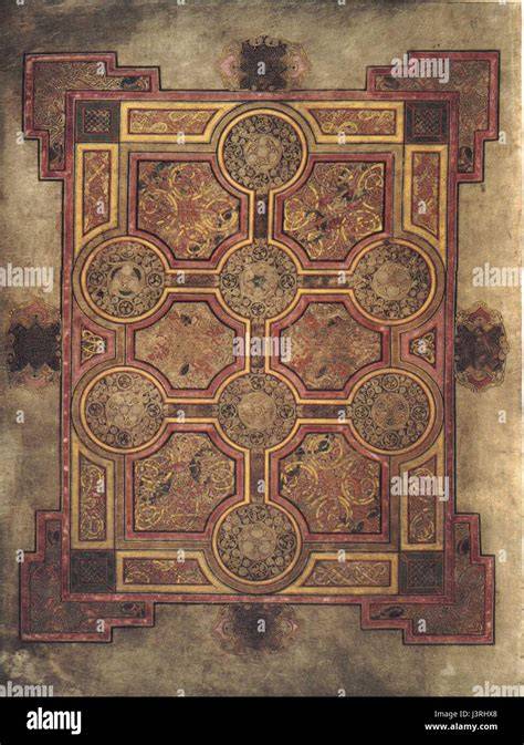
On the right is the cross-carpet page opposite the incipit, the beginning, of Mark.
Cross and carpet page for St. Matthew, folio 26 verso of the Lindisfarne Gospels, from Northumbria, England, c. 698-721. Tempera on vellum. British Library, London.
This ornate page, inscribed by Northumbrian monks on the island of Lindisfarne, is a prime example of the overlap of Christian and pagan imagery in northwestern Europe: here, a cross is decorated with the animal-interlace pattern characteristic of pagan cultures.
Matthew’s cross-carpet page exemplifies Eadfrith’s exuberance and genius. A mesmerizing series of repetitive knots and spirals is dominated by a centrally-located cross.
Compositionally, Eadfrith stacked wine-glass shapes horizontally and vertically against his intricate weave of knots. On closer inspection many of these knots reveal themselves as snake-like creatures curling in and around tubular forms, mouths clamping down on their bodies.
Chameleon-like, their bodies change colors: sapphire blue here, verdigris green there, and sandy gold in between. The sanctity of the cross, outlined in red with arms outstretched and pressing against the page edges, stabilizes the background’s gyrating activity and turns the repetitive energy into a meditative force.
The cross as the organizing principle
The cross is composed of a series of wine glasses, which likely represent the sacrament of communion.
The numerological teleology of the Lindisfarne Gospels’ carpet pages - their divinely purposed mathematical system - finds its best embodiment within the omnipresent motif of the cross.
As Michelle Brown notes in “Reading the Lindisfarne Gospels: Text, Image, and Context,”the status of the cross in the Medieval Christian world was that of a “universal trope of the ordered cosmos.”
With its four focal points, the cross gained all the theological connotations of the number four: “four cardinal points, four winds, four seasons, four elements and four rivers of paradise.”
In the words of fifth-century bishop and poet Paulinus of Nola, quoted by Brown, the four arms of the cross “divid[ed] the world into four regions to draw the peoples of every land into life.”
The alternative modes of reference to the carpet pages as “multiple-cross pages” and “cross-carpet pages” by medievalists such as Robert Stevenson and Jacques Guilmain make evident the significance of the cross-motif for medieval Christians.
Stevenson even identifies the fundamental “formula that four symmetrical back-to-back curves form a (negative) cross,” perfectly exemplified by the folio 2v design.
To name only a few examples, the little squares of yellow and orange trace Latin crosses throughout the main cruciform. Moreover, from the thin and dark gaps between those colorful little squares, the beholder can decipher rotated Greek crosses.
Thin and dark gaps between the stepped modules of the quadrilateral forms on the sides of the main Latin cross formulate a myriad of Latin and Greek crosses as well. Rotated Greek crosses also emerge between the stepped modules.
Serpentine creatures and animal interlace
In this artwork, serpentine figures curl and twist around each other in a complex and yet consistent way. The contrast is further seen in the big picture: the chaotic mass of snakes is balanced out by the cool colors and the symbol of the cross.
These snakes twist themselves into knots, their curvaceous and overlapping forms creating the illusion of a third dimension into which a viewer can lose him or herself in meditative contemplation.
This is a really complex and gorgeous carpet page, which includes snake-like creatures whose mouths clamp down on their own writhing bodies.
The snakes move through the ornament as if they were both creatures and lines, turning animal bodies into structural elements of the design. Their intertwined forms make the page appear simultaneously animated and mathematically controlled.
Color, geometry, and visual density
The cross-carpet page combines cool colors with red, yellow, green, blue, pink, brownish orange, and gold. This carefully controlled range of hues gives unity to an image whose surface is filled with countless small forms.
Look at the red geometric patterns top and bottom and right and left; notice the way in which the black outlines aren’t exactly perpendicular emphasising this effect.
What is intriguing with this cross-carpet is the central part of the design in that the lines are not completely straight; so this circular design looks almost as if it is slightly raised in the centre, a bit like the ‘boss’ on a shield perhaps.
At first glance, the carpet pages of the Lindisfarne Gospels overwhelm the beholder with the beauty of their elegant geometrical precision, ever-multiplying complexity, and wealth of vibrant colors - a beauty that may feel impossible to have been produced by human hands.
The carpet page of folio 2v is inscribed into a rigidly delimited rectangle, whose corners are symmetrically accentuated by motifs of red ribboning and yellow animal-like heads.
This rectangle is contoured by a rhythmically modular and colorful frame of interlace and bird-like figurations. The focal Latin cross, meanwhile, consists of six square forms, all joined by thinner rectangular tunnels.
Each of these six forms possesses a green square in its middle, with each green square further cut into with a white square at its center.
Moreover, the entire main cruciform - consisting of six square focal points connected by thin rectangular tunnels - is interspersed with ever-multiplying, diamond-rotated small squares of bright pink, brownish orange, and golden yellow.
These little squares, given their gradated technique of color application, form outlines of larger diamond-rotated squares that frame the six white-in-green squares.
On both its sides, the cross’s dimensions are mirrored by similar, geometrically simple yet vibrantly polychromatic shapes with diagonally composed squares.
Lastly, the entire composition is immersed within a background of webbed interlace, curvilinear and fluid, yet modulated into rigid squares via the conscientious application of yellow and red hues.
Planning and construction
These patterns did not come about by chance when Eadfrith was doodling away one wet afternoon. They were very carefully planned and constructed.
This is the back of that page. These are the guidelines made by lead point, the earliest example of it according to the great Michelle Brown.
However there are also pin prick marks where a set of dividers has been used to ensure that the distances between the lines on that central ‘boss’ shape are even.
Michelle suggests that some sort of back lighting was likely so that Eadfrith could follow his planned design.
At another glance, one directed this time at investigating their genealogy - their execution by a single hand, using only a compass, a straight edge, not even a ruler, and a few natural pigments - the carpet pages assume the status of marvel, if not miracle.
In “Pattern, Process, and the Creation of Meaning in the Lindisfarne Gospels” Benjamin Tilghman suggests that this intricate composition “emerged” out of the “process” of its design, rather than being “superimposed” upon the page from its inception.
Each previous form becomes the basis for the ‘process’ of determining the mode of ‘emergence’ of a new one. It is thanks to this process of production that the pages succeed so meticulously at their layered geometric mirroring, polychromatic harmony, and overall atmosphere of cohesive structural intertwinement and completeness.
Order and imperfection
Although the page gives an initial impression of rational perfection and complex order, its material state and design process contain unique gestures and dynamic interpretations.
After all, the upper-right corner of folio 2v lacks pigmentation by not one but two colors: red and black.
Moreover, the recto of its leaf reveals “visible imprints of regularly spaced prick marks,” imprints from which the skeleton of each design is to this day still “discernible,” as Inga Christine Swenson notes in “The Symmetry Potentials of the Ornamental Pages of the Lindisfarne Gospels.”
Additionally, Rupert Bruce-Mitford’s measurements reveal that the carpet-pattern of folio 2v is three millimeters shorter on the left side, 233 millimeters, than on the right side, 236 millimeters.
Furthermore, in imposing “disproportionate spatial areas,” the Latin cross removes the possibility of a horizontal axis of symmetry. Despite the persistent geometric rhythms of the composition, folio 2v fails to be perfectly symmetrical.
Even the zoomorphic interlace continues in one direction all around the frame - in other words, it is not vertically or horizontally mirrored.
Significantly, the birds’ heads are not flipped along the lower horizontal stretch of the frame either, which prevents a sense of naturalistic directional continuity throughout the four sides.
As Swenson remarks, the creatures do not even “correspond exactly”; beyond the diversity of color or wing-pattern, their beaks and legs all possess a quiet variety that “relieve[s] the preconceived, static framework.”
Thus, though the initial impression of the carpet page is one of rational perfection and complex order, unique gestures and dynamic interpretations riddle its material state and design process.
The meaning of visible process
These errors, oversights, and inconsistencies are highly improbable, and they are even more improbable to have been produced all together indeliberately.
In fact, they are unlikely to have occurred at all, given that “the carpet pages all appear on the verso of their respective folios,” so that the beholder witnesses Eadfrith’s “guidelines, pinpricks, and preliminary sketches before seeing the page in all its finished glory.”
Instead, these signs seem to embody a subversive “rationale of their own” that “subtly” but consciously “negate[s] the logic of the substructure.”
Taken together, these elements of visual imperfection start to emerge as a deliberate part of the pages’ visual vocabulary.
This tension between mathematical order and visible human labor is central to the experience of the page. The design appears to embody divine perfection, yet its guidelines, irregularities, and material traces keep the work connected to the body and hand of its maker.
The page offers a self-contained, yet all-encompassing, aesthetic microcosm of divine beauty, wealth, and perfection, of natural and mathematical wonder, of impervious integrity and ontological satisfaction.
This geometric-zoomorphic crowdedness generates anxiety through its unrelenting density and delimitation from the blank outsides of the page, an anxiety against lacking ornament and even the slightest potential absence of God-ordained mathematical beauty.
Nonetheless, its geometric creativity, its squashed yet expressive animal physiognomies, and its energetic modular and interlacing polychrome cannot but exude a sense of “playfulness, even of whimsicality.”
The devotional setting
The Lindisfarne Gospels were produced “for God and Saint Cuthbert.” Monks read from the manuscript during rituals at their Lindisfarne Priory on Holy Island, a Christian community that safeguarded the shrine of St Cuthbert, a bishop who died in 687 and whose relics were thought to have curative and miracle-working powers.
In 635 C.E. Christian monks from the Scottish island of Iona built a priory in Lindisfarne. More than a hundred and fifty years later, in 793, Vikings from the north attacked and pillaged the monastery, but survivors managed to transport the Gospels safely to Durham, a town on the Northumbrian coast about 75 miles west of its original location.
The pages can serve as an aid to meditation in the sense that they alert the reader that the subsequent Gospel text is important, and the reader should mentally prepare before looking at the following pages within the book or codex.
One can imagine devout monks losing themselves in the swirls and eddies of color during meditative contemplation of its patterns.
The pages express the Word of God without uttering a word, illuminating, as in decorating, the Scripture they safeguard while illuminating, as in revealing, its incomprehensibility.
Position before the Gospel text
To see the relationship between carpet pages and other pages in the text, consider how the carpet page from the Book of Matthew in the Lindisfarne Gospels precedes the incipit page.
The five carpet pages decorate and guard the reader’s entrance to the text and into each of the four Gospels.
The five non-textual pages that decorate and guard the reader’s entrance to the text and into each of the four Gospels seamlessly incorporate the properties of mathematical divinity and elements of human imperfection.
The carpet page of folio 2v, for instance, precedes the Gospel text and establishes a visual threshold between the physical page and the sacred narrative.
Carpet pages are reminiscent of Islamic prayer rugs, for they may also have had a similar function: these carpets can serve as an aid to meditation in the sense that they alert the reader that the subsequent Gospel text is important.
There are several possible origins for this type of carpet design, including contemporary metalwork, Coptic manuscripts, and Roman floor mosaics in post-Roman Britain.
Other carpet pages in the Lindisfarne Gospels
There are five carpet pages in the Lindisfarne Gospels, placed before the four Gospel texts and at the beginning of the manuscript.
- Lindisfarne Gospels, Carpet Page, folio 2v, 710-721.
- Lindisfarne Gospels, St Matthew, Cross-Carpet page, folio 26v, early 8th century.
- Lindisfarne Gospels, Carpet Page for Book of John, folio 210v, early 8th century.
- Lindisfarne Gospels, Carpet Page, Book of Mark, folio 94v, early 8th century.
The other four pages illustrate a comprehensive variety of cross-forms, not only Latin and Greek, but Celtic and Coptic, and new, equally brilliant, pigments.
A dense interplay of stacked birds teem underneath the crosses of the carpet page that opens John’s Gospel.
One bird, situated in the upper left-hand quadrant, has blue-and-pink stripes in contrast to others that sport registers of feathers.
Stripes had a negative association to the medieval mind, appearing chaotic and disordered. The insane wore stripes, as did prostitutes, criminals, jugglers, sorcerers, and hangmen.
Might Eadfrith be warning his viewers that evil lurks hidden in the most unlikely of places? Or was Eadfrith himself practicing humility in avoiding perfection?
The Lindisfarne Gospels
Materials, lettering, and manuscript context
The Lindisfarne Gospels were written before 720 and the scribe and artist was Eadfrith, Bishop of Lindisfarne, according to Aldred who added a colophon, a scribe’s note, at the back of the book in the tenth century.
Aldred’s colophon - an inscription that relays information about the book’s production - informs us that Eadfrith, a bishop of Lindisfarne in 698 who died in 721, created the manuscript to honor God and St. Cuthbert.
The Lindisfarne Gospels are an illuminated manuscript produced by the bishop of the holy island of Lindisfarne, Eadfrith, most probably in the first half of the eighth century.
Two-hundred and fifty-nine written and recorded leaves include full-page portraits of each evangelist; highly ornamental “cross-carpet” pages, each of which features a large cross set against a background of ordered and yet teeming ornamentation; and the Gospels themselves, each introduced by an historiated initial.
The codex also includes sixteen pages of canon tables set in arcades. Here correlating passages from each evangelist are set side-by-side, enabling a reader to compare narrations.
The manuscript was made on calfskin vellum and painted in tempera. Its designs were produced with natural pigments and carefully planned geometric guidelines.
Lettering and ornament beyond the carpet page
However, what is far more eye-catching are the wonderful colourful and decorated letters. The patterns range from interlace, to geometric red dots, to birds with necks and legs intertwined in the first and last strokes of the enlarged letter N at the start.
And it is the invention of letter-forms and their placement that is so delighted. Look at the letter U sitting comfortably within what actually is a V but looks like a U on the top line - NOVUM.
Note, too, the four birds’ heads hanging off the top serifs and springing up from the bottom ones on the squared-off letter O on the next line.
The intricacy of Eadfrith’s designs are quite amazing when magnified. The is the chi-rho page - the first two letters of the name Christ in Greek, not x and p as some believe!
Red dots feature heavily in this manuscript, in patterns around and between the letters as here. When the patterns are really enlarged the dots each have a dimple. This means that there would have been a dome.
These dots were done with a quill. The lettering is in a particularly clear Half-Uncial, and even if you don’t read Latin, you will be able to make out the letters once you have realised that the letter A is a ‘two c’ letter and the rather strange squiggle is a letter G.
This shows the clear letter-forms. Note the two c letter A at the end of the first line, TERRA, and the Half-Uncial letter G is the third letter from the end of the last line.
The Gospel portraits and symbols
There are also four author portraits of the Evangelists. This one shows St Matthew writing his Gospel in a book, with his symbol of a winged man blowing a trumpet behind him.
Luke’s incipit page teems with animal life, spiraled forms, and swirling vortexes. In many cases Eadfrith’s characteristic knots reveal themselves as snakes that move stealthily along the confines of a letter’s boundaries.
Blue pin-wheeled shapes rotate in repetitive circles, caught in the vortex of a large Q that forms Luke’s opening sentence - Quoniam quidem multi conati sunt ordinare narrationem.
Birds also abound. One knot enclosed in a tall rectangle on the far right unravels into a blue heron’s chest shaped like a large comma.
Eadfrith repeats this shape vertically down the column, cleverly twisting the comma into a cat’s forepaw at the bottom.
The feline, who has just consumed the eight birds that stretch vertically up from its head, presses off this appendage acrobatically to turn its body 90 degrees; it ends up staring at the words RENARRATIONEM, part of the phrase -re narrationem.
Luke’s portrait page is in marked contrast to his straightforward incipit page. Here Eadfrith seats the curly-haired, bearded evangelist on a red-cushioned stool against an unornamented background.
Luke holds a quill in his right hand, poised to write words on a scroll unfurling from his lap. His feet hover above a tray supported by red legs.
He wears a purple robe streaked with red, one that we can easily imagine on a late fourth or fifth century Roman philosopher.
The gold halo behind Luke’s head indicates his divinity. Above his halo flies a blue-winged calf, its two eyes turned toward the viewer with its body in profile.
The bovine clasps a green parallelogram between two forelegs, a reference to the Gospel. According to the historian Bede from the nearby monastery in Monkwearmouth, this calf, or ox, symbolizes Christ’s sacrifice on the cross.
Bede assigns symbols for the other three evangelists as well, which Eadfrith duly includes in their respective portraits: Matthew’s is a man, suggesting the human aspect of Christ; Mark’s the lion, symbolizing the triumphant and divine Christ of the Resurrection; and John’s the eagle, referring to Christ’s second coming.
The manuscript’s historical significance
The book is a spectacular example of Insular or Hiberno-Saxon art - works produced in the British Isles between 500-900 C.E., a time of devastating invasions and political upheavals.
The Lindisfarne Gospels have great historical significance in addition to their artistic value: in the tenth century, a priest named Aldred wrote vernacular translations of the Latin in between the lines of text, making this the first known version of the Gospels written in English.
You can see Aldred’s dancing Insular Minuscule gloss between the lines on the right; he added this lettering during the 100 years or so when the monks were at Chester-le-Street.
Aldred also inscribed a vernacular translation between the lines of the Latin text, creating the earliest known Gospels written in a form of English.
The manuscript’s dynamic movements between the Christian aspects of the infallible faith and the fallible body, coordinated with its fluctuations between the more abstract aesthetics of sight and the more tangible aesthetics of touch, appear paradoxical.
The Lindisfarne Gospels prompt an overwhelming sense of visual wonder and tactile delight. They provoke the beholder’s basic experiential curiosity but also command their reverence for the incomprehensible divine.
Wonderfully rich in color, imagery, textuality, and texture, they are deeply complex in their material construction, aesthetic design, and process of making.
All in all, the variety and splendor of the Lindisfarne Gospels are such that even in reproduction, its images astound. Artistic expression and inspired execution make this codex a high point of early medieval art.